“Nothing uses carbon like a first world human”

Channel 4 showed the thought-provoking second series of Utopia last year; a dark conspiracy thriller which centres on a graphic novel and the group of people who discover it. Episode 6 of series 2 opens with Terence (an agent for the network) as he shares his thoughts with a woman travelling with her young Son to the south of France. The woman explains how she is travelling by coach rather than plane in order to do her bit for the environment. Terence asks why she had a child in the first place and explains how having a child is a selfish act.

 “Nothing uses carbon like a first world human, yet you created one. Why, why would you do that? He will produce 515 tons of carbon in his lifetime, that’s forty trucks worth. Having him was the equivalent of nearly six and half thousand trips to Paris.”

Terence’s speech is all the more shocking because of his calm and psychopathic offer at the end of their encounter. Please be warned  you may find his offer/threat disturbing.

Utopia clip youtube

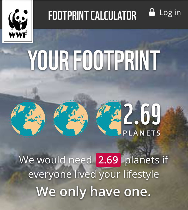
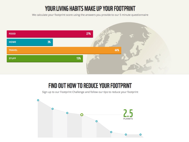
I’ve never considered the impact having a child has on the planet and calculating a child’s (or an adult’s) environmental footprint is complex because of the number of variables. The closest I could find online was the World Wildlife Fund for Nature’s environmental footprint calculator. I was surprised to find that my environmental footprint (below) is much larger than I thought and I don’t have any children!


Further content related to this blog:

http://www.theguardian.com/science/blog/2009/aug/04/population-climate-change-birth-rates

http://m.livescience.com/9701-save-planet-kids.html

https://footprint.wwf.org.uk/#/

Posted in Misc | Tagged , , , , , , , , | 1 Comment

A change or a rest?

This week will be my last working week at Telford & Wrekin Council as I’m taking voluntary redundancy. I have worked at the Council since I left school 25 years ago and although I’m sad to be leaving the many friends I’ve made over the years I decided several months ago that it was time for a change, a rest or possibly both.

After I made my decision to leave I began to update my CV but it wasn’t until this weekend that I attempted to create an infographic version; this was more for fun than to actually use. I made use of the free templates from PiktoChart and attempted to match the symbols from the template to my knowledge and experience (with limited success!).

The fully interactive infographic can be found on PiktoChart’s site.

If you are interested in CV infographics there are some great examples on Pinterest

Please join us at the Information Graphics & Visualisation Group on the Local Government Association’s Knowledge Hub. 

Posted in Infographics | Tagged , , , , , , , | Leave a comment

Now wash your hands

I visited my GP recently and while I was waiting I noticed the hand hygiene information graphic on his wall.

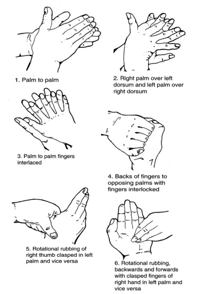
The six stages of hand washing used by health professionals (Ayliffe et al 1978) was developed to ensure all areas of the hands are clean before treating patients. Although I always wash my hands before handling food and after visiting the toilet, I only use part of the technique shown below.

The images below are combined with the instructions wet hands and apply soap.

wash hands no text

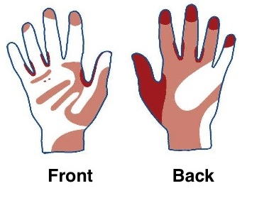
The areas of the hands most frequently missed when we wash our hands are shown below.

missed

Both images are from the Health Protection Agency’s leaflet – advice on hand washing for the general public.

Posted in Misc | Leave a comment

Bugs and batteries, what can you send?

If you have posted a parcel in the past few weeks the chances are you were asked what’s inside. The first time I was asked I thought the Clerk was being a bit nosey;  in fact the questions were for safety reasons.

Royal Mail has produced a leaflet explaining what you can and cannot post; although it’s a tad text heavy the symbols do help the sender to work out which category applies to their parcel.

I found it quite amusing that you are able to send live creatures through the post (they must be boxed and marked as such) but not batteries.

Posted in Infographics | Tagged , , , , | Leave a comment

Cost of Social Media

It has been a while since my last blog but here goes…..on 10th September I was lucky enough to attend Digital Futures, a free event hosted by Shropshire Council at Theatre Severn; the event celebrated the work of digital champions across the country and even featured a live Skpe link to No 10 (which worked by the way!).

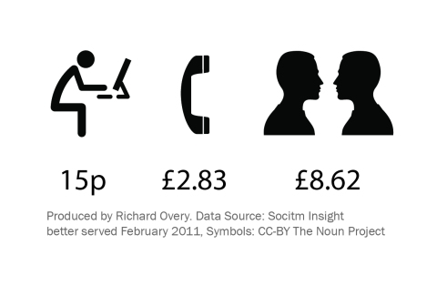
Vicky Sargent of Boilerhouse Media explained the financial cost of transactions and the benefits of channel shift to cash strapped local councils. Below is a quick infographic I produced using the Socitm data Vicky quoted and noun symbols (open source symbols from http://thenounproject.com/  which you can download using google chrome). The infographic shows a comparison of the average cost of transactions for the web, phone and face to face.

Average cost per transaction


Of course channel shift is only one element of providing a service to customers and several speakers mentioned the issue of digital exclusion, Alison Smith from Pesky People www.peskypeople.co.uk was one such speaker. Alison explained the issues surrounding digital exclusion for customers who have a disability, for example 1 in 3 disabled users have never used the internet compared with 1 in 10 of the able-bodied population.

Just two quick snippets from Digital Futures, further information can be found on twitter using the following hashtag #digifutures12 and a link to an article from the Shropshire Star featuring Dan Slee is shown below.

http://www.shropshirestar.com/news/2012/09/11/delegates-set-trend-at-digital-futures-conference

Posted in Infographics | Tagged , , , , , , , , , , , | Leave a comment

How productive is hot desking?

I was pleased to learn that my colleagues and I will be moving from Darby house in Telford Town Centre to the new civic buildings in my home town of Wellington.

New Offices on the left, Walker St, Wellington, Telford

The new offices are attached to the improved civic buildings which includes a new library, registry office, pool and gym; with the added bonus that the offices are 10 minutes walk from my home.

Not to mention the boost 200+ extra office staff will provide to Wellington’s local economy.

The only downside seems to be a 20% reduction in the number of desks and the dreaded words ‘hot desking’!

At a time when every council is feeling the pinch this method of working helps to save money on office space (often the second largest expense after staff themselves) but where did the idea come from and how does it affect productivity?

Wikipedia and several other online sources state that the term is a derivative of the term ‘hot racking’ used by naval officers who shared bunks for shifts. The term ‘hot desking’ became popular in the late 1980’s and early 1990’s.

A friend recently shared an article via twitter which explained that open plan offices were 66% less productive than private offices due to the extra noise, Julian Treasure provides some examples of how noise affects us in his TED talk. I wondered whether similar research had been undertaken into hot desking?

It seems several universities and the Institute of Work Psychology have carried out studies but the papers do not seem to be public, I did find an extract from a research paper by Kate Bonsall on the subject though.

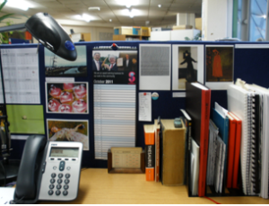
On a related subject the Guardian published an article on desk psychology, here is a picture of my current desk for you to analyse and a quick mindmap I produced on pros and cons of hot desking.

Posted in visualisation | Tagged , , , , , , , , , | Leave a comment

Do you still use a cassette tape or a phonograph?

Copied from Communities of Practice

This is my last blog post to Communities of Practice. The site will soon become obsolete (31st March 2012); I am sad that the CoP site is coming to an end but I’m also excited about the brand new Knowledge Hub.

The Information Graphics and Visualisation Community is migrating to the Knowledge Hub this weekend; thank you to Mike Macauley and his colleagues for creating the Hub and for their help with the migration.

Last year I discovered Jung Von Matt’s Museum of Obsolete Objects on youtube, a video archive of obsolete objects; I still own and use many of the items in the Museum such as the phonograph, polaroid camera and radio receiver. I received a wind up Gramophone for my Birthday which I love, not only because it’s old and beautiful but I also have a reason to collect old 78s!

Thank you to all those who have contributed to the Information Graphics & Visualisation Community on CoP and I hope to see you on the other side at the Knowledge Hub.

Posted in Infographics | Tagged , , , , , , , , , , , , , | Leave a comment

National Map of Shared Services


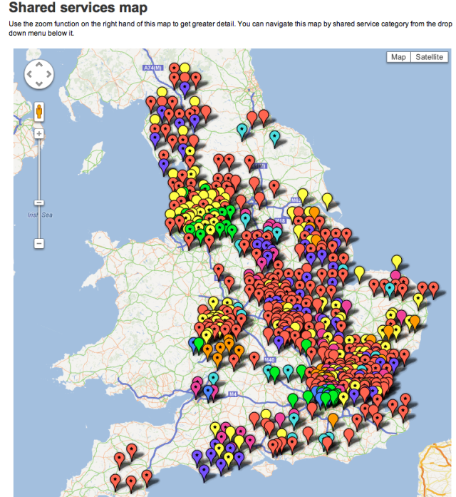
The Local Government Association have used Googlemaps to visualise shared services  throughout England as shown in the map below.

Although shared services may not be suitable for every council or for that matter every service, the drastic public sector cuts we are witnessing mean major changes for every Local Authority. A search of the Guardian’s Government Computing web pages show how many councils are planning or implementing shared services

The colours on the map indicate which service is being shared, the stars indicate operational shared services.

The interactive map and the source data can be accessed via the LGA’s website

Posted in visualisation | Leave a comment

New Year Resolutions

For many 2012 will start with the usual New Year’s resolutions, Teresa Wozniak an Illustrator from Halifax, Canada produced the poster shown below with a few suggestions.

I didn’t really make any resolutions but finish every book you have started reading and spend more time behind the camera rang a few bells with me.

In case you are wondering what bangs refers to, I think it’s an american/canadian term for your fringe!


Jocely K Glei Editor of 99% provides a different perspective on the process of making New Years Resolutions.

Visual.ly have also produced a visual guide to New Year’s resolutions using US data.

Posted in Misc | Tagged , , , , , , , , , , , , | Leave a comment

The 10,000 Hour Rule

10,000 hours is believed by many to be the magic number of hours needed to become an expert or the best in a particular field.

Malcolm Gladwell discusses the 10,000 hour rule in his book Outliers, Gladwell states “Practice isn’t the thing you do once you’re good. It’s the thing that makes you good”. In other words becoming an expert is not about innate talent but rather about how much dedication you have to continue practicing a skill or a profession.

Gladwell is interviewed about his book and the 10,000 hour rule in this video clip.

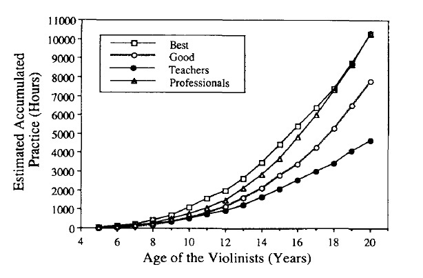
Gladwell’s book cites K A Ericsson a Pschologist at Florida and his colleagues who produced a study called ‘The Acquisition of Expert Performance and Deliberate Practice’. Ericsson and his colleagues studied musicians at Berlin’s Elite Academy of Music. They grouped the violinist into three groups – those unlikely to play professionally, good and world class. They all started to play violin at about the same age but those who became the best increased the amount of practice as they got older.

The diagram below summarises some of their findings.

Source: K. A. Ericsson, Krampe, R. T., & Tesch-Römer, C. (1993). The role of deliberate practice in the acquisition of expert performance. Psychological Review, 100(3), 363-406

Not everyone will want or need to become an expert in their field however the old saying ‘practice makes perfect’ does seem to be true.

Posted in Misc | Tagged , , , , , , , , , | Leave a comment